Monday 1 July 2013

Visual Recording


Topic 1 - M Shed Report


Wednesday the 4th September, the M Shed which is located by Bristol Docks, displayed a free photography exhibition in which I attended. This exhibition had a collection of photographs portraying human form portraiture in various different styles in order to win a potential prize. This exhibition featured work from many different photographers including Justin Sutcliffe, Annie Colligne, Mark Mcevoy and many others. A first, second, third and fourth prize was awarded to the photographers whom showed most potential and meaning through their photographs according to the National Portrait Gallery organization. The venue of this exhibition was also clearly thought out as it had a zigzag split down the middle of the room , creating an interesting, divided split to display each photograph. 

First Place
First place in the portraiture photography exhibition was awarded to Jord Ruiz Cirera for his portrait of Margarita Techroeb. Collecting a prize win of £12,000 this London-based Spanish Photographer has inspired many by his photograph of a shy 26 year old, religious Bolivian woman. This woman is a Mennonite and the religious community in which she is involved in usually forbids photographs, this is shown by her awkward body position and her shyly concerned facial expression. This photograph was part of Jord Ruiz Cirera long-term project named Menonos where he documented life of the community among Margarita individuals and family. However due to aspects of this religion it was very difficult and took a long extent of time before Cirera received any consent to photograph people within this religion. Using only natural lighting in this winning photograph, Cirera only collected two frames altogether of this woman which again highlights the difficulty and unwillingness these people have to face when interfering with their religion. I like this photograph mainly for the simplicity of it. Her facial expression and body position gives the photograph meaning and implies this woman is uncomfortable and doing something in ordinary. The use of aperture is also demonstrated effectively in this photograph by slightly blurring the background to produce focus to the subject however staying clear enough to indicate the simple furniture in the background, I believe the photographer would have used an aperture around f8. Along with her facial expression I believe the lack of eye contact is also an effective clue to how she is feeling while this photograph is taken. Overall i believe this photograph is an outstanding piece of work because of different photographic techniques for example having the focus on the subject highlighted by aperture and the positioning of the woman in the middle of the rule of thirds even though it is clear she doesn't want to be centre of attention. However I believe this photograph could have been more effective if the image was shot from an angle looking slightly down on this woman which would reveal more of her body and how it is positioned as well as having a hidden meaning of her religion looking down upon her for doing something he is not meant to be doing. 

Second Place

Second Place was awarded to Jennifer Pattison for her portrait of Lynne, Brighton. This nude photograph of Lynne was one of many nudes and landscapes within a unnamed collection by Jennifer Pattison. Lynne was a friend of the photographer and posed for her in an empty bedroom of a house located in Brighton. On the National Portrait Gallery website is states that Pattison says, ‘There is an interesting shift in the consciousness of the sitter during the slow process of making these portraits; a moment in the quiet where they become unaware that they are naked. I capture them as they drift to another place. With no direction Lynne adopted this straightforward pose, bare and undaunted, looking straight down the lens and beyond.’ I love this quote in which the photographer spoke as it has great truth among it, once the model is comfortable and gets into the zone of feeling natural and normal with their surroundings while nude, the photograph which is taken will appear ordinary and the subject will not look or feel daunted in the situation they are in or the place of their surroundings.  I like this photograph because although some people may think it is unacceptable I have respect for how comfortable the subject is within her own skin, this is highlighted by the casual stance of the model while holding a mug as if in an ordinary situation. The smile on her face also gives this photograph character and creates a more natural persona to the image. In addition I believe the focus is on the woman entirely, not from using a low aperture but by placing her in front of a plain background with no distractions and using lighting  shining mainly on the model. However i believe this photograph could have been improved by making the model do a normal day to day activity while nude to strongly highlight and contrast her nudity with normal activities and surroundings therefore portraying the human body as normal, natural and beautiful. 

Third Place

Third place was awarded to Spencer Murphy for his portrait of Mark Rylance. Spencer Murphy was born in 1978 and grew up in Kent. He has gained a BA in Photography at Falmouth college of arts and mainly enjoys photographing famous subjects. This photograph is of Mark Rylance, an actor who was photographed  for the front cover of the Telegraph Magazine, promoting Rylance's return to the Globe, performing as Richard III. Spencer Murphy stated ‘I’ve always enjoyed working with actors as there’s no awkwardness or discomfort in front of the camera and they are able to understand direction and react to it very easily. Mark was no exception.’ This is understandable as famous individuals, particularly actors know how to act in front of a camera as they have had great experience of this and don't daunt themselves over simple instructions. I like this photograph and the angle in which the subject is facing, the close up shot of Mark Rylance is effective and his facial expression is more prominent and visible to detect. His lowered eyebrows and slightly saddened eyes contrast effectively with the half turned up smile in which he is showing. This can be interpreted as he was sad before his return to acting therefore highlighted by the smile in which is creating upon his face. His scruffy shave, dressed in a vest and sloppy slicked back hair also indicates he was nothing while not acting, he didn't have to make the effort but now he can. Rylance is clearly happy that his return to acting is near and this juxtaposes with his bright eyes on display contrasting with his dull presence. I believe this photograph is very effective and a lot of information can be interpreted by it, however I believe it could be improved by shooting the actor in his own personal surroundings to show how his break from acting effected his life. 

Fourth Place
Finally Forth Place was awarded to Alma Haser for her portrait of Luke and James. Alma Haser was born into an artistic German family in 1989. She then moved to the UK in the year 1995  and gained a BA in photography. This prize winning photograph was shot in her shared house in London with the two subjects being best friends from the age of 12. This photograph was previously intended to be two individual portraits but due to lack of concentrating from both subjects she decided to photograph them together. Alma Haser stated ‘I asked them to sit on a tiny, wobbly coffee table, forcing them to almost cling onto each other. Ultimately I wanted to turn their verbal banter into a visual image. The title is designed to help viewers make up their own stories about what is going on.’ I like this quote because you can interpret this photograph in many different ways. At first I looked at this photograph as two childish adults who are physically intertwined with each other because they don't know any better. However once I read Haser's quote I look upon this photograph slightly differently. The consequence of a wobbling coffee table makes these two individuals grasp upon each other which also indicates a comfortable feeling among the two individuals which highlights their friendship. I believe they are adults and act as adult but among each other turn into children. This is shown vividly due to the style of the photograph being some what similar to a school photograph of siblings, these two friends could be looked upon as brothers  by the fact they have a very close relationship. The position they are in shows support and comfort with each other from the grasp of holding on and a relaxed persona is pursued by their body structure. I believe this photograph is very effective however I believe it could be improved by a shot of the two friends doing something personal to them, this would give evidence to their personality and what they enjoy doing together. 

Photographs I like

A photograph I particularly liked in the portrait exhibition was 'Lola Smoking' taken by Alice Pavesi Fiori. This photograph was taken amongst a collection of other photographs in a 1930's fashion inspired shoot. This photograph shows clothes of Alberta Ferreitty and was taken on a Polaroid camera on the first sunny day of that year. I like this image as the quality of the photograph works perfectly with the 1930's theme and creates an appearance as if this photograph was taken in that time zone. The shadow and angle of this photograph is also interesting as you can see along the beach into a faded distance. Although aperture wasn't an option on this camera the focus is still on the female subject and the shadows work effectively in showing the weather of that day. I particularly like her body position and graceful appearance with a cigarette which in the 1930's was seen as classy. 

Another photograph in the exhibition that I was very fond of was PC David Rathband which was taken by Justin Sutcliffe in July 2010. This police officer was shot in the face and lost his sight which meant his eyes were replaced with artificial ones. PC Rathband was interviewed a year after the attack by the Independent on Sunday and then featured in a variety of photographs. I believe this photograph is very inspirational and full of emotion due to the fact that this man is brave enough to be featured in photographs and staying strong throughout the whole shoot. Even though his eyes were replaced you can scene a sad emotion from him and this is enhanced by a slightly low aperture , focusing upon the scars on his face. The lowered sides of his mouth indicated his distressed emotion and how his lives events has effected his happiness. In addition the close up angle and plain background significantly enhances the serious issue in which being photographed. 

Photographs I Do Not like

I didn't particularly like David Stewart's photograph of the 'four hats' as I don't think it showed much potential in comparison to other photographs in the exhibition. Although shot from an interesting angle with a background to provide the allusion of the sofa in an upward position, I don't think the character of each subject is strong enough and the relationship between each person is difficult to detect. Each characters body position is different from one another and I believe it would flow much more successful if each person sat in a very slight altered position when running along the sofa to juxtapose the angle in which the photograph has been taken from. Although this photograph clearly does show four hats, the meaning of why the hats are relevance is lacking within this photograph, this is the reason I don't particularly inspire to this photograph. 

Another photograph I didn't really inspire to was the portrait of Victoria Pendleton by David Clerihew. Although the models stance detects that the woman is a strong individual, her facial expression is rather bland and doesn't show much of her personality. There are good aspects to this photograph for example the definition of her muscles enhances her strong structure and indicates what her hobbies may be. However I believe this photograph would be more effective if the subject was photographed in a feminine position among her sporting equipment to contrast her past time with her personality.


Topic 2 - The Scream


The Scream is a very famous piece of art consisting of four different versions created by both painting and pastel. The scream was developed by expressionist artist Edvard Munch between the years of 1983 and 1910. 'Der Schrei der Natur' which means 'The Scream of Nature' is what Edvard Munch named his masterpiece after producing a portrait of an unknown figure with an unsettled expression, grasping their face in front of a unique landscape of bleeding orange skies and faded figures in the background. Arthur Lubow described The Scream by saying it was  "an icon of modern art, a Mona Lisa for our time." This piece of art inspired thousands of people and changed the art movement significantly at that time. Munch created four different versions of The Scream, two being in the media of paint and two in pastel. The National Gallery, Oslo, contains one painted version (1893). The Munch Museum contains the second painted version (1910) as well as a pastel version from 1893. The forth version from 1895 created by pastel was sold for $119,922,600 at Sotheby's Impressionist and Modern Art auction to a financier named Leon Black on 2 May 2012. The scream is extremely famous and all versions are worth a significant amount of money, they have been a massive target of theft and have been previously stolen before. 

Individual Recreation of The Scream


When recreating The Scream in photographic form there were elements of the artwork in which I had to take into consideration before photographing my subject. The vital aspects of The Scream in which I noted were the facial expression of the subject, two unfocused individuals in the background in addition to the railings positioned on the side of my subject which disappear into the distance giving the photograph depth. Therefore this photograph is one of my best unedited shots as I believe it juxtaposes well with The Scream and provides similar information but in a photographic form. To create an extended depth of field within this photograph I captured this with my camera on a angle looking up on my subject which created a linear depth from the railings and had my camera on aperture f8 to create a blurred far distance but still clear enough to see what is there in the image. The ISO in which I used in this photograph was also quite low of around 100-200 as this was taken outdoors on a light day. This photograph could then be edited further on Photoshop to create a stronger resemblance between the original piece of art and my individual recreation.  
Furthermore I also captured a very similar shot to my previous photograph with the difference of a portrait view instead of a landscape to resemble the original Scream. However I believe the general atmosphere created by the facial expression and body language is more effective in my first image. 


Topic 3 - Natural and Constructed Photography
For this topic we focused on Natural and Constructed photography. Before shooting my own images, I researched other artists within this topic to gain knowledge and inspiration.


Natural Photography

             Ansel Adams

Ansel Adams was an American Photographer and was also an environmentalist. His photography of natural aspects usually consisted of black and white tones within a landscape of America, favourably captured in Yosemite National Park. His work has been widely accepted and published in posters, calendars and books. From his work it is clear that he particularly inspires to capturing trees and various other plant life within the topic of Natural photography.

This is an example of a photograph created by Ansel Adams which demonstrates Natural Form from an unique perspective. The use of aperture technique is also visibly clear as the texture of the bark is hard and crisp whereas the leaves are more of a smooth appearance. I believe Ansel Adams used an aperture of around f8 as the background isn't completely blurred. Although I like this photograph, I believe I would prefer it if there was a wider variety of dark and light tones which would enhance the texture significantly. However I do understand how this photographer hasn't darkened the image too much as he wants to keep the texture of the leaves in the background still visible to the eye.  


My Examples of Natural Form Photography

This is an example of one of my photographs in the shoot which focused on Natural Form. For this photograph I decided to focus on using the aperture setting within a close up angle. To do this I decided to capture this plant as I believe the texture was effective and I was attracted by it's vivid color  therefore I thought this would be a perfect example to demonstrate the use of aperture.

This is another example of a Natural Form photograph in which I took inspiration from Ansel Adams and his love of trees and texture in bark. To enhance the texture of the bark upon this tree I decided to use a very low aperture to keep in focus a small section of the tree while blurring out the rest nearly completely , this photograph was taken on an aperture of around f3.2. This photograph is also captured from a close up angle along the tree rather then from straight on angle therefore this meant the aperture worked more effectively by drawing your eye to the right hand side of the photograph first.                                               

For this photograph I decided to capture the topic of Natural Form with an image of a bird. With an aperture of around f8 I captured this photograph from an angle slighting above, looking along the wooden pier as the duck stood perfectly still looking into the distance. I also like the lighting on the water in this photograph as it shows each ripple which eventually fades into the distance. However if I was to recreate this photograph I would capture this from an angle slightly lower down and with a smaller aperture to blur out the background as I believe it is slightly distracting. 


Constructed Photography

Aaron Siskind

Aaron Siskind was an American photographer who was considered to be part of the abstract expressionist movement. The beginning of his inspirational photography is known to have started when he received a camera for a wedding present and started taking photographs whilst on his honeymoon. Aaron Siskind doesn't only focus on constructed photography but also natural form, however he captures his photographs on a flat surface to create a different image to whats actually there.


This is an example of Aaron     Siskind's abstract  constructive photography. This photograph is using perceptive in an abstract angle which is very effective and interesting. This photograph is of a brick wall however you have to study the photograph before realizing this as the photograph is not taken from a generic angle. I like how this image uses aperture within the perspective so that the bricks fade into the distance. This feature works nicely with the black and white tones of the photograph as the texture is bold and interesting, eventually fading into an unfocused blur which tricks the eye.


My Examples of Constructed Photography

This is one of my photographs portraying the topic of construction within photography. I have taken this from below a line of various different balconies but only focusing on the bottom of one, however using an aperture which unfocused the background but not enough to discard what is in the background entirely. I believe I have captured this image effectively in an abstract form and I am pleased with the sharp texture that is visible upon the wood below the balcony which is in focus, I believe this way of capturing objects gives the photograph a lot more character.

This is another photograph representing the topic of Constructed photography. However instead of capturing this photograph in an abstract form, I have decided to focus mainly on the texture within this photograph demonstrated from a man made object.I mainly like how depth is formed in this image shown by the paint physically peeling away from the wooden wall and the various cracks of paint emerging around the focal point of this image. 

Finally this is my last but favorite example of constructive photography. Using a low aperture and creating perspective in an abstract from I captured this interesting photograph of a wall made from cubes of rippled glass. I believe the light bouncing of the glass is very effective and it shows the shape of the glass almost like you could feel the ripples yourself although it is only a photograph. From this picture it has made me realize that I enjoy linking aperture setting and perspective skills within photography together as i believe the combination create a really interesting outcome.


Combination of Natural and Constructive Photography

This is an example of a photograph I 
captured which includes both Natural and Constructed elements. I like the lighting upon the water in this image as well as the composition of both the duck and the piece of concrete jutting out from the corner of the photograph. I believe the main focus point of this photograph is the right hand side of the rule of thirds however I believe each element of the photograph works well juxtaposing with each other while still all in focus. To improve this photograph I could have altered the aperture slightly to enhance the focal point of the image. 


Topic 4- Perspective

One key aspect within photography techniques is perspective and using perspective effectively in your photographs. Perspective is something that gives your photographs depth in the way you capture your image as your photograph will always be flat. Perspective is important to show the viewer of your photograph distance within your image so they understand what you are capturing. 

The definition of perspective in photography can be interpreted  'the sense of depth or spatial relationships between objects in the photo, along with their dimensions with respect to the viewpoint (camera lens or the viewer). http://www.picturecorrect.com/tips/perspective-in-photography/


Examples of Drawn Perspective


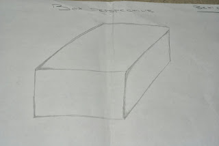
To understand perspective photographically I was firstly asked to practice drawing perspective to understand guidelines within perspective which I would have to imagine while capturing the photograph. Firstly I was asked to draw the perspective of a box as I saw it when placed nearby. Afterwards make the perspective drawings slightly more difficult I was asked to draw the perspective of a model plane. Finally my third perspective drawing was of the hallway within the college building, I believe this drawing was the most difficult however the one which made me understand perspective a lot more clearly as guidelines are significant to creating a correct perspective.  


Perspective Photographically

Once perspective was understood through the media of drawing the task was then given to create a few photographs which show perspective effectively through a digital form. 

This is my first example of perspective within a photographic form. By using a slightly lowered aperture I was able to enhance the depth of perspective in this image by blurring out the the object as it runs into the distance.  To create perspective within this photograph I stood very close to one end of the object but still captured the end of the object in view, this create the illusion of this metal bar beginning large in the picture and slowing decreasing in size the further along the picture gets, this effectively created depth in my photograph. 

Secondly this is another example of the technique of perspective captured from a different angle. This photograph was taken by facing my camera up the length of a building and this created depth which is significantly shown from the windows fading into shadowed ellipses from a lower angle from which I am looking.

In this photograph I have experimented with perspective as well as reflection. I captured this image alongside a building made from reflective glass, perspective is shown clearly as the windows eventually fade away into a darkened linear pattern of no reflection. I believe the use of perspective and reflection combined was very effective and unique therefore I would like to practice this combined technique again within my photography.

Evaluation of Visual Recording

Overall I believe all the topics in which I have studied in Visual Recording has helped me develop my photography skills significantly. Beginning the Visual Recording unit with my M Shed report gave me an understanding of different styles of photography and making your photography unique to yourself, producing your own style to your images. Secondly moving onto the topic of The Scream improved my analysis skills of art based work to then produce my recreation in digital form. In addition the topic of Natural and Constructive photography also intrigued me to be more adventurous with my photography and finally the topic of Perspective widened my knowledge of the technical side of photography to create an interesting image. All these skills which I have developed in this unit will positively effect my own photographic creations. 

Difficulties In Visual Recording 

I believe that the Visual Recording unit was an overall success. I didn't have any major difficulties in this unit of work however I have improved my skills of perspective the most out of each topic I have studied. The thing I found hardest in this the topic of perspective was the drawn diagrams as I found getting  the guidelines of each picture correct rather tricky, however I eventually overcame these difficulties and if i were to do it again I believe I would find it a lot easier.


Mshed Wildlife Photographer of the Year exhibition

On Wednesday the 4th of December I visited the Mshed to view wildlife photographs chosen to be presented in the exhibition. Along side a variety of interesting photographs the gallery was split into different sections which was visibly appealing and unique, for example there were real life animals, insects and plant life behind glass containers in addition to puzzle boxes which each individual could interact and learn from. 

Photographs I Liked

When entering the gallery my eye was particularly drawn to this photograph amongst many others. This photograph was given the name 'Eye of a Toad' and was captured in icy waters at sunset by Lucasz Bozycki. The photographer sat in this water until the toads were comfortable with his presence and I believe this is significantly shown by the naturally calm exterior of this creature. I mainly inspire to this photograph because of its deep and rich colours working with a high aperture to draw the focus point towards the toad. I also like how some detail of the rippled water is in focus and slowly fades out as I believe it enhances texture within the photograph in a unique technique. 
                       
This photograph was also one of my favorite within the whole wildlife photographer of the year exhibition. This particular photograph was in the 15-17 year old category within the wildlife photographer of the year exhibition. I love the texture within this photograph which is significantly enhanced due to a high aperture and the location which is in focus is sharp and crisp in detail. Overall I thought this was an outstanding photograph and the use of photographic techniques and lighting upon this animals face is extraordinary. 


Ideas and Concepts

SMA Plans- Small Group

 When put into small groups, we had to generate ideas to eventually produce a story line for our group Stop Motion Animation. At first we listed what materials we could work with, for example; People, Lego or Plasticine  we then produced ideas which could be created using these materials. While collaborating on each idea we decided that Plasticine would be a good material to use as we had already researched Ardman Animations and gained inspiration from it. As a group we then all agreed that a snail was the simplest thing to make out of Plasticine therefore given the time we had it would be easy to construct the video which we wanted. At first we had the idea of a slug crawling into a shell to become a snail, however we figured this would be quite difficult without creating large gaps within the animation. We then figured if we each made a snail each out of Plasticine then we could create some sort of race in which each of our snails would be competing.
Therefore from what ideas we created, our group drew up a story board in which we could work from as a guide when creating our stop motion animation. The process of Story boarding is very useful, even though when doing the Stop Motion Animation, things may change and be erased from previous ideas, its still a guide to remind you of the chronological sequence within the story. Inn addition as a story board is visual, it is a very quick method to look back on without wasting time reading instructions.  

Individual Ten Second SMA Plans


After having produced a ten second animation within small groups the next task was to create one of our own. This animation was to also be ten seconds which would consist of around 150 photographs. Therefore to create something that would last for so many frames, a mind map was in order to generate ideas to figure out what I could create. After roughly ten minuets on my mind map I decided to choose the topic of using food. Therefore with various ideas linked to food I had to decide which one was the best idea. Asking other members within the class and gaining there thoughts upon my various ideas, I came to the conclusion that I was going to base my Stop Motion Animation on a gingerbread man in which I thought the music to fit in with the video could be of a magical and happy theme.

Once I had chosen my ideas, I drew up a quick storyboard which I could use to remind me of what my ideas were visually to make it easier when it came to actually making my animation. With a quick description on the side of each drawing I was ready to then start making my animation.


Durex Challenge

After being sorted into groups we were given a Durex Challenge. This challenge consisted of making a poster in which advertised Durex condoms within the teenage market. We were given a few examples before we began, in which all provided a humorous aspect within each advertisement. However this was based on a serious topic as the increase in teenage pregnancy's have escalated, therefore we wanted to create an idea which would be a play on words but also nip the message into the bud for all teenagers to be sexually aware of the consequences of unprotected sex. 

Mind Maps and Ideas


Within a group of five individuals we all collected ideas from each other, some in which contrasted and some which could be linked with each other to be elaborated into a new combined idea. Therefore to stimulate our ideas we began by making a list of things that connect with Sex for example the homosexual community, STD's and poverty within a young mothers life. Then basing our advert on an humorous aspect of sex, we started to focus on the fun side of sex and thought about flavoured condoms for oral sex which would protect against STD's. From this idea of the various different flavors it made us think about a box of sweets or chocolates in which you could have various different flavors also. From this we then drew up a heart shaped chocolate box in which each flavor of condom would sit inside as well as original condoms to promote safe sex. Once our plan was drawn with a few adjustments, we then decided there should be a slogan to fit the picture to attract an audience. Fitting with the box of chocolates theme we realized we could use the phrase 'life is like a box of chocolates, you never know what you're going to get' and change it to 'Sex is like a box of chocolates..' which provided a clever and humorous play on words. 


Bouncing Ideas Within A Group

The method of bouncing ideas off each other within a group is a very beneficial exercise to create new interesting ideas which include aspects thought by everyone in the group. By hearing different ideas and taking them into consideration, the previous idea you had in mind could be improved by combining it with other ideas. This exercise also stimulates everyone's thoughts, therefore created a situation where everyone can suggest many ideas whether they become the final accepted idea or not. This exercise doesn't just generate creative thinking but also benefits and improves social skills and team work for each individual. Some individuals also find thinking creatively difficult therefore this exercise helps practice thinking more laterally by using other members of the groups ideas to accomplish a greater final idea.


Evaluation On Ideas and Concepts

Overall I believe the topic of Ideas and Concepts was very important to enhance creativity and generating various ideas. The use of group discussions, mind maps and story boards all helped with planning and creating my own SMA without forgetting key points in which I had to include. I believe if there was no planning involved within this course the outcome of my work wouldn't be as successful as it is now. 

Difficulties In Ideas and Concepts

Overall I didn't find many difficulties within Ideas and Concepts as I found this unit very useful. However I have developed my discussion skills and the technique of bouncing ideas within a group. Usually when I create an idea for something I want to keep that idea to myself, however when practicing group discussions and bouncing ideas off one another I found the ideas that I had originally created, were developed and modified to become something much more inspirational by different ideas input by other group members. Therefore I believe that idea discussion is the key to success within the working environment.

Stop Motion Animation


Stop Motion Animation

Group SMA

Stop motion animation is a form of video which is made from a variety of photographs strung together to create motion. The first topic in which I am studying in BTEC extended diploma Photography course, is stop motion animation. For this topic I will start with creating a ten second group animation and will eventually create my own animation which will consist of over 1000 photographs, music and will last for 1 minute long. To understand and practice stop motion animation before doing it ourselves, I was involved in being one subject within a group stop motion animation. For this, one person in the group took a photograph each time everyone in the group moved, therefore this is a slow process to create a simple movement. To prevent big gaps and glitches within a stop motion animation it is vital to move very slightly for each photograph, therefore when these images are strung together a smooth movement will be the result on film. When all the photographs have been taken for the stop motion animation they will then have to be uploaded to an available computer which has Photoshop.  When the photographs are selected and lined up on Photoshop in chronological order, there will be an option to refine the images and select how many frames per second you want your video to be, this will determine how fast the video will flow. A good example of successful stop motion animation would be the work of Sledgehammer by British musician Peter Gabriel as well as Aardman Animations who have created masterpieces such as Wallace and Gromit. 


Aardman Animations

To gain knowledge and inspiration I studied Aardman Animations in the topic of stop motion animation. Aardman Animations have created genius ideas, mainly recognized for Wallace and Gromit, Chicken Run and Shaun the Sheep.  Aardman Animations has a recognised reputation of model animation and this was proven when Aardman studios had ten Oscar nominations and won four. Aardman Animations all started from two friends by the name of Peter Lord and David Sproxton where they started the animation at school. The name Aardmin Animations was eventually then registered in 1972. After, in 1976 when both friends had graduated, they moved to Bristol and created Morph for a children's program named 'Take Hart'. Although producing animations mainly for a children's audience, Peter and David were always interested in producing  animations for an adult audience, in which the older generation had something that could be relatable to their own lives.  Conversation Pieces supported by Channel 4 television enabled the two friends to create animation puppets linking in with real life conversations. With films like 'Early Bird' being created within a local radio station this gave people the opportunity to realise that anyone could be characterized in to an animation form. In 1985 Aardman Animations had a new member joining the team. After Peter and David met Nick Park at the National Film and television school, the two friends then realized the potential of Nick as he worked on his student film 'A Grand Day Out'. Before long Nick Park joined Aardman Animations full time.  These three geniuses then started to create recognizable masterpieces. 

Sledgehammer


To broaden my knowledge of Stop Motion Animation I also researched Sledge Hammer by Peter Gabriel,who paired with Aardman Animations to create this unique music video. The video for Peter Gabriel's album of 1986 song 'Sledgehammer' involves a 5 minuet 40 second long stop motion animation. This video includes motion formed through human form as well as aspects created by Plasticine. This video was so clever and inspirational that it won various awards including;  record nine MTV Awards and Best British Video at Brit Awards in 1987. In addition Peter Gabriel was nominated for three Grammy Awards which were; Best Male Rock Vocal Performance, Song of the Year and Record of the Year. As of 2011, Peter Gabriel's video Sledgehammer is the most played music video of MTV's history.
 I believe Sledgehammer is very inventive and the flickering facial expressions due to each photograph giving the video an interesting effect. The video is introduced with different body parts moving like the eyes , ears and mouth, before the mouth movements create the illusion of Peter Gabrielle singing to the music. I believe the video is also impressive due to the fact that this video was made in 1986 where technology wasn't incredibly advanced, therefore this video would have taken great time and preparation which has clearly paid of as it is still impressive till this day. This stop motion animation also flows very well with the song as the artists actions reflect the words which are being sang, for example when the word 'sledgehammer' appears in the song the video juxtaposing with the words shows a smashing like motion in the video to create an appearance of the sledgehammer being used within the screen of your computer. Although inspired by this video there are also aspects which I think could be improved. For example trying to maintain facial expression which could involve how wide the eyes are or how raised the eyebrows appear, to create a more smooth transition in emotion on film, this will hide the gaps and glitches more effectively in the stop motion animation. 


Chicken Run

Chicken Run was the first full length film created by Aardman Animations, funded by Dreamworks. This film was directed by both Peter Lord and Nick Park and was released in the UK as well as the US in the 2000. Chicken Run was a great success and gained over $220M at the worldwide box office. The story is about two farmers who aren't making enough money due to lack of eggs, if the chickens were failing to produce any eggs per week they would be killed. This film is shot from the chickens perspective and shows their many efforts to escape this treacherous farm. The main characters in this film are Rocky the rooster and Ginger the chicken which represent the heroic leaders of the pack of chickens. This film is full of suspense and emotion created by Plasticine which truly inspires me as these characters are brought to life and feel real. This gives the chance for the audience viewing this film to connect to the chickens which have an emotional role within the film. This film provides humor for the younger audience but also provides a deeper meaning of animal cruelty understood by the adult audience. I believe this was potentially done as Aardman Animations want to provide all audiences with material that they can connect or relate to. Chicken run took over two years to create and be released. It took the animators of Aardman Animations an entire day to shoot 36 frames (1-1/2 seconds of film). Overall Chicken run was 77 minutes long and involved 110,880 frames. It is also known that at times 28 teams of six animators were shooting all at the same time. These facts and figures proves how long and well prepared a Stop Motion Animation can be, it is a difficult process and can take years to produce at top quality. Overall I believe Chicken Run was a masterpiece and I am truly inspired by everyone who was involved. The entire movie runs extremely smoothly and the movement of each characters mouth is perfectly in time with the speech, I could not fault this creation if I tried.

Suzie Templeton - Dog 


When researching other stop motion animation artists I stumbled across Suzie Templeton and her range of animation creations. Suzie Templeton is mainly recognised by her animation 'Peter and The Wolf' where she won the 2008 Academy Award for best Animated Short Film. Her animations include various different models which can be related to and appear realistic. I was particularly inspired by her animation 'Dog'. This short film is about a grieving boy over his dead mother, seeking for reassurance and support from his farther. Each model has extremely detailed facial expressions and the body structure of the model is dependent on the mood in which the models are in, similar to that of a real person. This story is extremely emotional and moving and can be related to by certain individuals. The intense emotion portrayed by the models feels very real and their surroundings seem that of reality within a normal humans household. Each models body and mouth movement is very smooth therefore there is no glitches and gaps in this animation creating effective transition of movement on film. Overall I believe this animation is extremely effective mainly due to the emotion you feel when you watch it, as if it were reality. In addition the story line is cleverly thought out and it is something that everyone could imagine the difficulty if they were in that situation themselves. To conclude I am very inspired by this artist and her work.


Ten Second Group Animation

Before producing my own individual Stop Motion Animation I was put into a group of four to create a ten second long video to gain practice and experience before making a better one myself. While brainstorming, our group decided that we would like to focus on using plasticine, taking inspiration from Aardman Animations from creations such as Chicken Run. Establishing the material we were going to work with we then started to decide what we were going to make out of the plasticine. Due to its simplicity we finally decided to create a snail each out of plasticine, we then developed our thoughts to create a story in which these snails would be part of. At first we thought of producing a slug and capturing it moving along to eventually crawl into a shell to become a snail. However we then decided this would be quite hard with the minimum time we were given. We then decided on creating a 'Snail Race' as it was simple as all we had to do was move each snail a fraction each photograph. 

Improvements For Ten Second Group SMA


Overall the group stop motion animation was successful and the story of the snails was easy to detect. However we realised aspects of improvement that could have been made if we were to make this video again. For example due to limited time we had, the snails we made out of Plasticine did appear rather amateur and some movements weren't as smooth as they could have been. There are a few gaps and glitches within this stop motion animation so this could be improved by moving each snail subject more slightly each time. I believe the main thing I have learned doing this is that making a stop motion animation using Plasticine is a lot more complicated then I previously anticipated and a lot of time would have to be involved to create a professional appearance. Time management is vital within the stop motion animation process. 

Individual SMA


Over al my individual SMA was successful and runs for 10 seconds, created by 160 photographs and set on an aperture of f8. When making this animation I set up my tripod to keep a steady frame within my animation and blue tacked the Greggs bag to my table to prevent sudden movement. In addition when I started to eat my gingerbread man, I drew around his body therefore after a bite was taken he could be placed in his original position as if he didn't move at all. When all my images were ready to be made into a video I uploaded my photographs onto a computer and opened Bridge. When in Bridge I selected the option of 'Batch Rename' to prevent gaps in my animation. After this I then resized all of my photographs to create a faster animation. After this I then opened Photoshop where I chose 'window' then 'animation'. This created an animation bar at the bottom on Photoshop where I could insert my photographs. Moving my resized and renamed images in to a new folder, I then proceeded to open them on Photoshop. To do this I selected 'File', then 'Open' and once I found my photographs I selected the first image and ticked the 'Image Sequence' box. This meant I was able to choose how many frames per second I wanted my animation to be. As I took 160 photographs I decided to make my Stop Motion Animation 15 frames per second. In result my animation runs for 10 seconds therefore I was happy with my final result.

Difficulties In Individual SMA


I did experience some difficulties when making this animation. In my video there is a rather big black blob running through my entire animation, at first I thought this was a result of a crack in my lens, however I eventually found out there was a speck of dirt on the mirror inside my actual camera. This was eventually resolved by being cleaned with a spray of dense air. If I was to do this animation again I would capture my animation with a clear lens and from a birds eye perspective as I think it would be more effective.


Adding Sound To My SMA


After creating my individual Stop Motion Animation I proceeded by inserting a sound clip to run along side my video. For this I could have got my music clip off of youtube however I had a piece of music especially made for my animation. Therefore as my music was already on my desktop I chose 'File' and selected 'Show in Finder'. Once this was visible within Finder I then dragged the song into 'Quick Time Player'. Once I saved my animation as a movie file I finally had to drag my song into the animation bar on Photoshop. Therefore this was the final result and I believe the music and animation work well together in creating a mystical feel. 


Evaluation Of Stop Motion Animation


Overall I have enjoyed the topic of Stop Motion Animation. At first when I was presented with various examples of Stop Motion Animations that have been created,I felt very skeptical of the idea that id be able to create a decent one myself. However from the research of SMA artists and the practice I have now had in this topic, I believe my individual SMA was very successful and I was pleased with it, however when I create another animation I know it will be of much higher quality as I will take into consideration what I needed to improve in my Gingerbread man Stop Motion Animation. In addition from experiencing what it is like to create an animation myself, I now am more inspired by companies such as Aardman Animations due to the fact of the huge amount of effort they put into their work and how wonderful the outcome is. 

 Difficulties Within SMA

My main difficulties within Stop Motion Animation was firstly working with Plasticine as it is extremely difficult to create a realistic character to move or look effective to the eye, I experienced this difficulty in the small group 10 second Stop Motion Animation. Also adapting to the computer functions of an Apple Mac was also rather difficult as I am used to using Windows computers, however from guidance and instructions I have now improved my IT skills and find it relatively easy to achieve what I want to on the computer without having huge complications. This will therefore improve the timing of any other animations I will create.


1 Minute Individual SMA   


Other SMA's


To start with I decided to look up other Stop Motion Animations to gain knowledge and inspiration. This Animation is using barbie dolls as if they were real and contains strong humour throughout. Because this animation was funny it grabbed my attention and made me watch it until the end. This made me decide that I wanted to create a funny and slightly odd/weird animation to keep the audience intrigued. This animation also made me realise how realistic you can make toys seem. I also enjoyed how speech was involved to create a story line, however for my animation I do want to include a funny song instead.  

This is another video including barbie in a Stop Motion Animation. However this one doesn't include speech but emotive music to create a scene. This is a short animation in comparison to my first choice however I have mainly taken inspiration from the music choice and the different angles included within the animation. 


Ideas and Thought Process   

For my one minute SMA I started with some research on various different stop motion animations too give myself ideas of my own. From this research it was clear that a vital element within a stop motion animation is to have a general meaning and story line behind the animation. With this in mind I started to think of a story in which I could recreate through the media of Stop Motion Animation. From this I made the link in my mind that stories need imagination and with imagination anything can seem real. The most vivid imagination I can ever remember having was when I was a child where I used to pretend the stuffed animals and toys I owned were real, alive and moving. This then gave me the tools to develop this thought in a Stop Motion Animation, where the main meaning behind the story would be 'Who's to say, a child's imagination is not real?'. With the moral of my story in tact I then decided I would capture the toys in which I own, moving and interacting with each other as if they were alive. As my story had a child like theme, I decided the best music to combine with my animation would be a popular nursery rhyme or lullaby.     


Making My Animation

Overall my animation was generally a success, however I did experience some technical problems, which I only came across when putting my images together. If I was to repeat this process and make this animation again firstly I would make sure the text is all in focus with a high aperture at the beginning of my animation. In addition when panelling my camera view point and moving closer towards my subjects of focus I could have been a bit smoother in moving the tripod to create a smooth transition of movement which in result would create a smooth and un jolty animation. 


Difficulties With My SMA

To start with, my original idea for this Stop Motion Animation was to photograph a child's legs getting out of bed and leaving the room while the contents of their bedroom 'came alive' and out to play. However when putting my tripod in position I realised the view point from my camera was too close and not enough of my composition was in frame due to my cameras fixed lense. This is when I decided to make my toys come alive on my bed as if an invisible youngster was playing with them. At first I tried to hold my text introducing my animation in front of the camera, however this was difficult to capture the image and hold correctly in posistion. Due to this I then decided to capture my text laying down in a fixed posistion. However I believe this could have been improved as my animations introduction appears rather amateur and not perfectly in line which is quite unsettling on the eye. Therefore overall I could have improved my general panelling to create a smooth transition of movement and also general camera settings like aperture on Manual setting.   


Final Product

This is my final animation including music. When adding a music clip from Youtube I cut it shorter in Garage Band to fit the one minute animation in which I created. I also made the end of the song fade out, however in my actual animation it didn't seem to work and cuts off quickly which sounds a bit amateur however I knew it was due to technical problems. Overall I believe the my music choice definitely fits with the animation and also includes humour within my animation. On the other hand there was many elements in which i could have improved for example smaller movements with the tripod when panelling to create a smooth movement rather then a jumpy one.